When it comes to home projects, the early stages of planning can be the most exhilarating. Choosing the perfect color palette for a room is a particularly enjoyable exercise, as you get to explore a range of hues and shades. However, before you start painting, there’s one tool you should consult that you may not have used since elementary school: the color wheel.
The color wheel is a visual aid that can help you select complementary colors that work well together. By understanding how to use it, you can create a harmonious blend of colors that will make your home project truly stand out. In the following paragraphs, we’ll explore how to use the color wheel for your next project.

What Is the Color Wheel?
The color wheel is a circular diagram that displays a range of colors. It typically includes shades of red, orange, yellow, green, blue, purple, and magenta, arranged in a rainbow-like sequence. The wheel’s usefulness lies in the fact that colors positioned opposite each other are considered complementary. For example, red and green, yellow and purple, and orange and blue are complementary colors.
Complementary colors create a high-impact look through maximum contrast. Despite being opposites, they do not clash but instead appear brighter and more vibrant when paired. These combinations enhance or emphasize qualities of their opposites. The result is a more impactful visual and a vibrant pairing.
Using the color wheel can help you create visually appealing designs by understanding how colors work together. By pairing complementary colors, you can create a high-impact look that draws the viewer’s attention.

How to Use the Color Wheel to Choose a Paint Palette
Rely on the “60-30-10” Rule
When it comes to selecting colors for your paint project, it’s important to choose shades that work well together to create a balanced and harmonious look. One effective method for achieving this is by using the “60-30-10” rule.
To use this rule, you’ll need to select three colors from the color wheel: one that will represent 60% of your room, one for 30%, and another for 10%. The dominant color should take up 60% of the palette, while the secondary color aims for 30%, and the accent color for 10%. This will ensure that the space feels well-balanced and visually appealing.
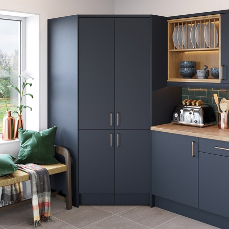
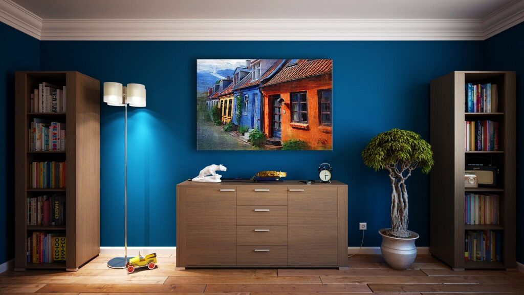
To choose the three main colors, you can start with a color that you would like to use as your dominant color. For example, if you want to paint your living room a light blue color, you can use that as your dominant color. Then, you can select a darker shade of blue for the secondary color and choose a complementary color, such as a moody orange, to use as accents in the remaining 10% of the space.
Complementary colors sit opposite each other on the color wheel and enhance each other when used together. This creates a vibrant effect that can make your space feel more visually appealing. For example, you could pair a soft pink with a Kelly green and use a shade of vanilla as a calming accent. Pinks and reds sit opposite green on the color wheel, making them harmonious and visually striking when used together.
By relying on the “60-30-10” rule and choosing colors from the color wheel, you can create a well-balanced and visually appealing paint palette for your space.
Consider Breaking the “Rules”
When it comes to choosing a paint palette, the traditional method of using complementary colors from the color wheel is not the only option. You can also opt for analogous colors that sit next to each other on the wheel, neutral colors, or varying shades in a monochromatic palette.
While the complementary color wheel and the 30-60-10 rule can be helpful tools, it’s always an option to break the “rules.” Looking for outside inspiration can also be a good gut check.
One way to find inspiration is by looking to nature. For example, pairing lavender with a bright or minty green, inspired by a lilac bush, can create a beautiful combination. Mother Nature often pairs colors together in stunning ways, such as green grass against a blue sky.
Ultimately, it’s important to love the combination you choose. Don’t be afraid to think outside the box and trust your instincts. By doing so, everything will naturally fall into place.


